Ant Design Form component for seamless conduct
Ant Design form is a React UI library that has abundance of easy-to-use components that are useful for building elegant user interfaces.
One of the components is <Form>. It provides built-in functions for collect, validate and submit user input. <Form> in Ant Design is using a decorator pattern for the fields. This is not a problem until you want to separate the form and fields.
Here is a simple example.
import { Form, Input, Button, Checkbox } from 'antd';
const layout = {
labelCol: {
span: 8,
},
wrapperCol: {
span: 16,
},
};
const tailLayout = {
wrapperCol: {
offset: 8,
span: 16,
},
};
const Demo = () => {
const onFinish = values => {
console.log('Success:', values);
};
const onFinishFailed = errorInfo => {
console.log('Failed:', errorInfo);
};
return (
<code>
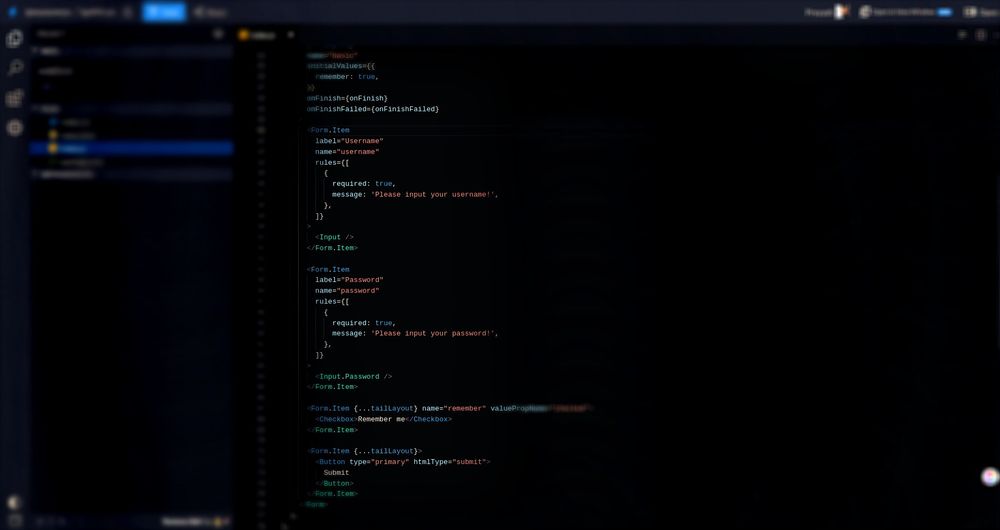
<Form
{...layout}
name="basic"
initialValues={{
remember: true,
}}
onFinish={onFinish}
onFinishFailed={onFinishFailed}
>
<Form.Item
label="Username"
name="username"
rules={[
{
required: true,
message: 'Please input your username!',
},
]}
>
<Input />
</Form.Item>
<Form.Item
label="Password"
name="password"
rules={[
{
required: true,
message: 'Please input your password!',
},
]}
>
<Input.Password />
</Form.Item>
<Form.Item {...tailLayout} name="remember" valuePropName="checked">
<Checkbox>Remember me</Checkbox>
</Form.Item>
<Form.Item {...tailLayout}>
<Button type="primary" htmlType="submit">
Submit
</Button>
</Form.Item>
</Form>
</code>
);
};
ReactDOM.render(<Demo />, mountNode);
Getting Started
In this tutorial, we’ll build a basic application to showcase Ant Design's react form component. Our first step will be to set up our boilerplate. I’ve done so using create-react-app.
Then we’ll need to add the antd dependency to the project:
yarn add antd
or
npm i antd
Before we start building our <CustomForm /> component, we’ll add a reference to it in the root component:
import React from "react";
import ReactDOM from "react-dom";
import Todo from "./todo";

import "./styles.css";

function App() {
  return (
    <div className="App">
      <CustomForm />
    </div>
  );
}

const rootElement = document.getElementById("root");
ReactDOM.render(<App />, rootElement);
Building the CustomForm Component
Now we can start building our <CustomForm /> component. Open a new file called CustomForm.js with the following contents:
import { Form, Input, Button, Checkbox } from 'antd';

const CustomForm = () => {
  return (
    <Form
      name="basic"
      initialValues={{
        remember: true,
      }}
    >
      <Form.Item
        label="Username"
        name="username"
        rules={[
          {
            required: true,
            message: 'Please input your username!',
          },
        ]}
      >
        <Input />
      </Form.Item>

      <Form.Item
        label="Password"
        name="password"
        rules={[
          {
            required: true,
            message: 'Please input your password!',
          },
        ]}
      >
        <Input.Password />
      </Form.Item>

      <Form.Item name="remember" valuePropName="checked">
        <Checkbox>Remember me</Checkbox>
      </Form.Item>

      <Form.Item>
        <Button type="primary" htmlType="submit">
          Submit
        </Button>
      </Form.Item>
    </Form>
  );
};
Cool! Now let’s add layout and submit method in our component.
import { Form, Input, Button, Checkbox } from 'antd';

const layout = {
  labelCol: {
    span: 8,
  },
  wrapperCol: {
    span: 16,
  },
};
const tailLayout = {
  wrapperCol: {
    offset: 8,
    span: 16,
  },
};

const Demo = () => {
  const onFinish = values => {
    console.log('Success:', values);
  };

  const onFinishFailed = errorInfo => {
    console.log('Failed:', errorInfo);
  };

  return (
    <Form
      {...layout}
      name="basic"
      initialValues={{
        remember: true,
      }}
      onFinish={onFinish}
      onFinishFailed={onFinishFailed}
    >
      <Form.Item
        label="Username"
        name="username"
        rules={[
          {
            required: true,
            message: 'Please input your username!',
          },
        ]}
      >
        <Input />
      </Form.Item>

      <Form.Item
        label="Password"
        name="password"
        rules={[
          {
            required: true,
            message: 'Please input your password!',
          },
        ]}
      >
        <Input.Password />
      </Form.Item>

      <Form.Item {...tailLayout} name="remember" valuePropName="checked">
        <Checkbox>Remember me</Checkbox>
      </Form.Item>

      <Form.Item {...tailLayout}>
        <Button type="primary" htmlType="submit">
          Submit
        </Button>
      </Form.Item>
    </Form>
  );
};

ReactDOM.render(<Demo />, mountNode);
Click on submit button and this is the output you get
Success:
{username: "preyash", password: "preyash", remember: true}
That's how easy it is to make a form with Ant design. If you’d like to learn more about Ant, check out their docs.